Sunoco is an American oil company started in 1890 out of Pittsburg, PA, when Joseph Newton Pew and Edward O. Emerson expanded their already established gas business to oil. In a few years, the company became the area's leading supplier of crude oil. Over the years, the company became a massive success and launched various services. Thus, the company holds a great place in people’s lives, and many collect items, especially those relating to the Sunoco Logo.
Sunoco opened its first gas station in the 1920s, and in 1925, the company went public on NYSE. Moreover, Sun Company ventured into other parts of the industry in the coming years, like refining on multiple locations. The company is also known for establishing its name in the mining industry in the early 1940s. And after that, the company has opened in several places like Canada and Venezuela.
In the early 1960s, the company started entering the public eye through culture—by partnering and sponsoring with motorsport figures like Mark Donohue. After that era, the company reshaped itself with a new headquarters and reorganization. In the early 80s, the company began rebranding itself as Sunoco ULTRA 94. However, after the solid 22-year run, the ULTRA 94 was discontinued.
Now, the logo only consists of SUNOCO, which has a very appealing look and is a household name. Additionally, with the rise of the online era, the company has taken great strides in embarking on its websites, online apps, competitions, franchises, merchandise, products, and services. In 2020, the company celebrated the century of its existence by revolutionizing the industry and reshaping the course of American lives.
Minimalist Approach In Sunoco’s Logo Design
Sunoco’s design is a trademark of the company’s legacy; no one can take their originality. However, a lot of hardwork goes into curating a design that is minimal for the time and nostalgic for the people so that they won’t forget the brand's impact on their lives. On top of that, ensuring a proper color scheme in the logo makes it memorable and catchy to the eye for marketing purposes. And that’s why Sunoco’s logo has it all, making it a great example of minimalist branding design.
Proper Research Conduction
Sunoco’s designers had a great idea about creating a perfect logo, resulting from proper research. They knew everything about the market, making it more simplistic and catching. On top of that, the essence of a century-old company is preserved in the logo, and even different generations can recognize the brand.
Simple And Eye Catching
Secondly, Sunoco’s logo is very simple and eye-catching, as whenever someone looks at them, they can easily recognize the place. Also, with the onset of several other services by Sunoco’s parent company, people can get other things from their outlets on the gas stations. An important role is played by the tall billboards that display their brand to the people miles away on the highway.
Space Is Perfect
The space between the logo is perfect as it’s not too wide, too thick or narrow, making it very appealing. Additionally, it does not require much area to display until you’re trying to put it on your wall as vintage metal signs.
It has a great color scheme, which is perfect for the eye—not too sharp or vibrant for the people. Lastly, it has both brand and typography, making it more engaging.
Great Typography
The logo text is great and suits any environment and person whatsoever; not only that, it has great alignment in the logo, making it visible and readable to the crowd.
Thus, these are some of the great minimal facets of Sunoco’s logo making it a collectible heritage for your home or garage. People who love the old times can grab hold of Sunoco’s vintage signs to feel on a trip once again.
Conserving And Flashing Minimal Aesthetic Of Sunoco’s Logo With Vintage Metal Sign
ChromeDomz is a custom metal company specializing in high-quality stainless steel wall art, signs, and more. Our products are built to last and made with attention to detail. Whether you're looking to add a unique touch to your home, garage, bar, recreational room, or man cave, ChromeDomz has many options. Lastly, we value our customers and strive to provide excellent products and services. So, if you’re searching for a minimal Sunoco logo, don’t hesitate to reach us on any platform.

Conclusion
Sunoco, an American oil company, began in 1890 and has since expanded into various industries, including refining and mining.
- The company's logo design, a trademark of its legacy, is a minimalist approach that preserves the essence of a century-old company.
- The logo is simple, eye-catching, and has a perfect space between it.
- The color scheme could be more sharp and vibrant, and the typography is great.
- The logo's alignment and alignment make it a collectible heritage for those who love the old times.
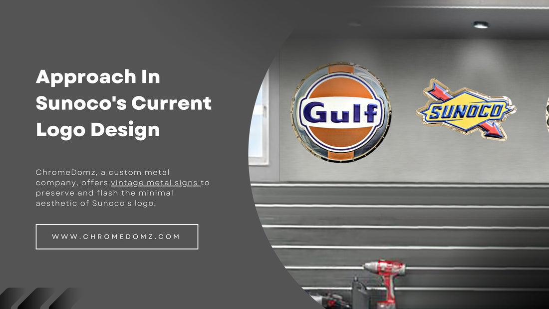
ChromeDomz, a custom metal company, offers vintage metal signs to preserve and flash the minimal aesthetic of Sunoco's logo.
Frequently Ask Questions (FAQs)
Where can I find a Sunoco logo metal sign?
One can find great Sunoco signs at the online store of Chrome Domz. Moreover, the company does have other brands as well, like Mustang.
How much are vintage metal signs worth?
The value of a vintage metal sign depends on various factors, including the sign's condition, rarity, and popularity, and can be worth upto thousands of dollars.
What are vintage metal signs?
Vintage metal signs were made before the 1970s and are popular collectibles.
What is the Sunoco logo?
The Sunoco logo is a red and white keystone with the word "Sunoco" written in blue. It symbolizes strength and stability.


